
overview
I led user-centred design activities to replace a complex paper registration process with a secure, accessible digital service.
It is used by education providers and local authorities to access learner data, improving efficiency while meeting stringent security and government standards.
client
Major government department
role and duration
Interaction designer
Wireframing, prototype development using the GOV.UK prorotype kit, user flow mapping, stakeholder enagagement and accessible design
Oct 2024 – Apr 2025
The challenge
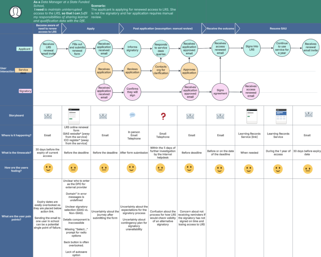
The service’s legacy paper-based registration process was inefficient, error-prone, and burdensome for users and internal teams alike. It involved a 22-page form that was generic, difficult to complete, and often required manual clarification, causing delays and poor user experience. Internally, data had to be manually checked and stored in SharePoint, creating additional risks and inefficiencies.
A review of security and data protection processes highlighted the need for stronger governance, including annual re-verification.
Our solution had to:
Increase governance and automate renewals
Improve security while maintaining a seamless user experience
Ensure accessibility for all users
Align with government digital standards
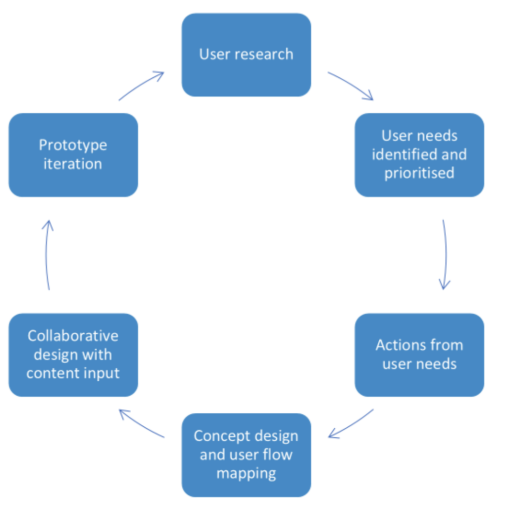
Our approach
user-centred research
Moderated and unmoderated usability testing (via Lookback and surveys) with both internal and external users
Qualitative interviews to uncover pain points in the registration process and test assumptions
Quantitative feedback to validate design decisions at scale
Accessibility testing with proxy users representing a range of impairments (mobility, visual, cognitive, and hearing)
Ran accessibility demos and awareness sessions with specialists to upskill the team and embed inclusive practices
design and prototyping
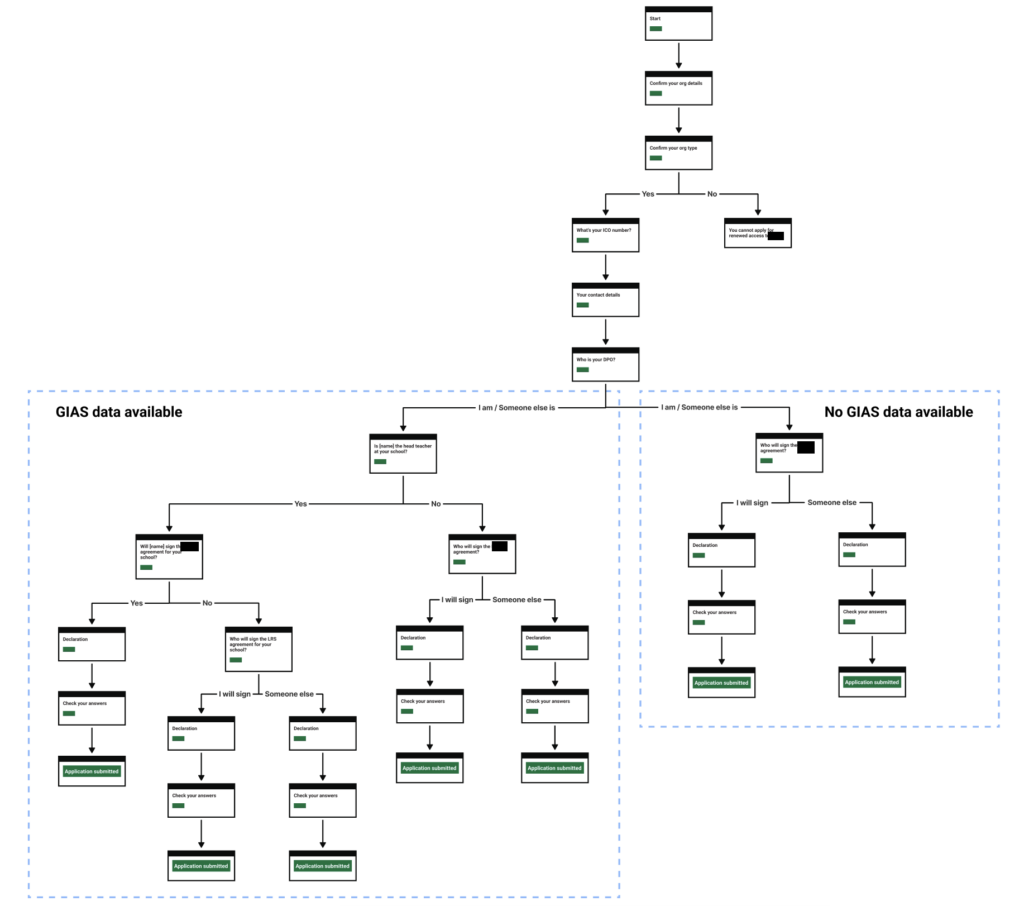
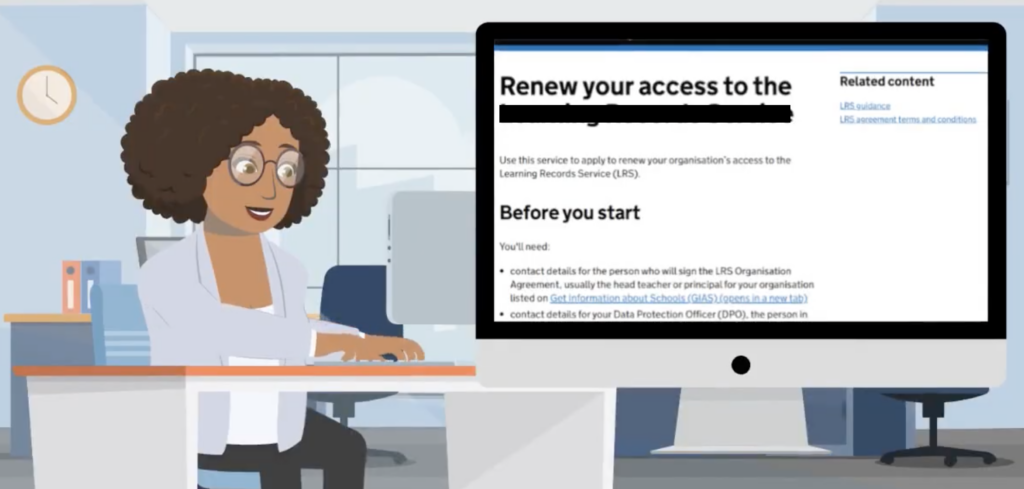
Created dynamic digital forms that adapted to organisation type. Research showed users struggled to identify which sections applied to them, so we introduced conditional questions based on organisation type (e.g. state-funded school company, charity or sole trader), which significantly reduced errors and follow-up.
Mapped user flows and iterated prototypes using the GOV.UK prototype kit, maintaining consistency using GDS design system and style guide (e.g. using common components and plain language).
Logged design decisions and traceability in design histories to ensure continuity and rationale through project phases.
stakeholder engagement
Conducted insight playback sessions and prioritisation workshops to align teams on user needs and actions
Addressed stakeholder concerns around security and reputational risk through storytelling and structured evidence
GDS beta assessment
As part of this project, I completed my first GDS beta assessment, working closely with the team, particularly the user researcher, to prepare for the review.
We brought all supporting evidence together in a shared Lucid board, making it easy for assessors to follow how user research informed design decisions throughout beta. I led the service demo, walking through three end-to-end user journeys from the prototype and highlighting key content and design changes driven by ongoing research.

I also produced an animated user journey video clearly communicate research insights and user needs to both senior stakeholders and GDS assessors.
The service met key design-related Service Standard criteria, demonstrating a strong user-centred and accessible approach to delivery, including:
Understand users and their needs
Make sure everyone can use the service
Have a multidisciplinary team
Use agile ways of working
Use and contribute to open standards, common components and patterns
The service successfully passed private beta, with positive feedback on its user-centred approach, accessibility, and evidence of iteration.
The team ran a well-structured, engaging session on the development of the registration and new renewal process. The demonstrations were easy to follow, and all team members answered questions well.
Key results
SERVICE EFFICIENCY
Reduced time to complete registration from hours (22-page form) to under 10 minutes
Internal review process now largely automated, freeing up analyst time and reducing human error
ENHANCED ACCESSILBITY
Removed inaccessible components (e.g., testing showed the Details component caused confusion for screen reader users, so we removed it entirely rather than attempting to patch it)
Improved screen reader support by adding ARIA labels and descriptive links
Accessibility testing directly informed design decisions, leading to fully WCAG-compliant interfaces
IMPROVED USER SATISFACTION
Introduced annual renewal with built-in automation and structured re-verification
98% of users rated their experience as “Good” or “Very good”
Previously unstructured, indefinite access now managed securely and transparently
POLICY AND SOCIAL IMPACT
Easier registration has opened up access to the service for more education providers, ultimately benefiting thousands of learners
Raised accessibility awareness within the department, contributing to cross-government UX maturity
Lessons learned
Leadership matters: The absence of empowered leadership hindered alignment and slowed decisions. Future projects must establish clear governance upfront.
Role clarity: Blurred responsibilities, especially in the absence of key roles like content design, led to delivery risks. This reinforced the importance of establishing clear role boundaries and escalation routes early, something I now prioritise at the start of new projects.
Conflict resolution routes: Lack of escalation pathways meant that interpersonal issues lingered. Senior support structures are necessary.
Reflection
This project was a true test of inclusive design under constraint – balancing user needs, policy goals, and complex legacy systems. Despite internal challenges, we delivered a user-validated, secure, and accessible solution that modernised a critical public service.
The work highlights the role of user-centred design, collaboration, and continuous improvement in delivering better, more trustworthy government services.