
overview
We conducted a Discovery-Alpha to research and design a guided pathway service aimed at helping parents navigate the complex process of separation resolution. Building on evidence from previous discovery work, we aimed to address the challenges parents face when making child and financial arrangements.
We wanted to learn: Is it possible? Is it accurate? Is it valuable? Is it viable?
client
Major government department
role and duration
Interaction designer
Workshop facilitation, user research, wireframing, content and interface design, prototype development
Apr – May 2024 (8 weeks)
The problem
Separating parents struggle to understand the options they have, the pros and cons of each, and ultimately how to agree their child and financial arrangements for their specific situation.
How might we better support separating parents to identify the ‘right’ way to solve their child and financial disputes?
our hypothesis
We believe a guided pathway will improve the experience of parents who are navigating their options during a separation and will lead to an increase in attempting early resolution options
our approach
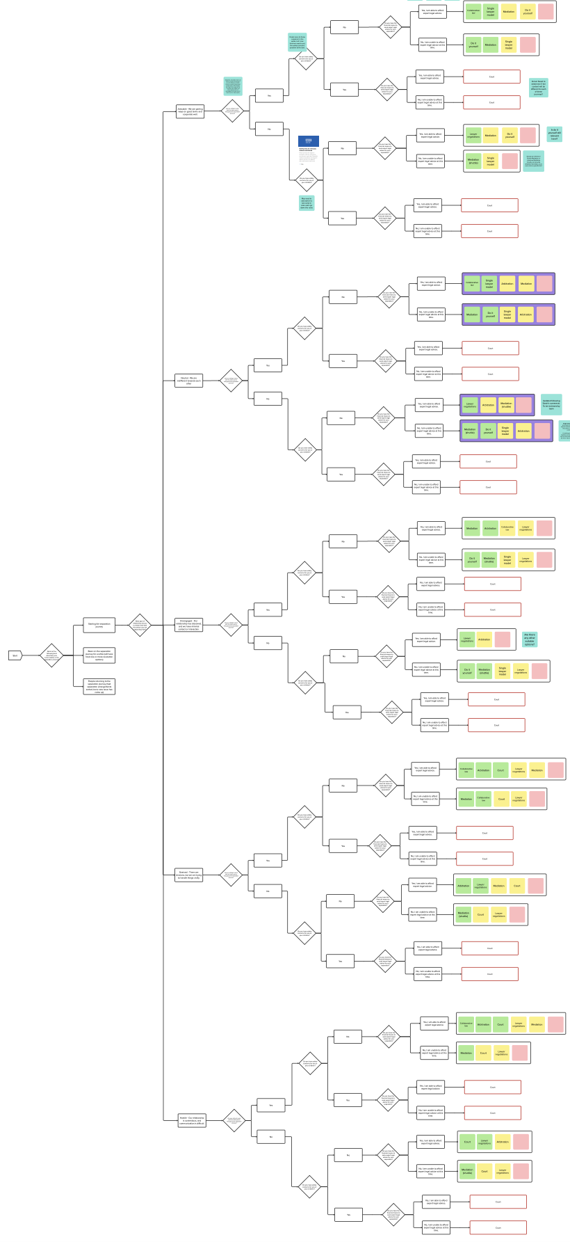
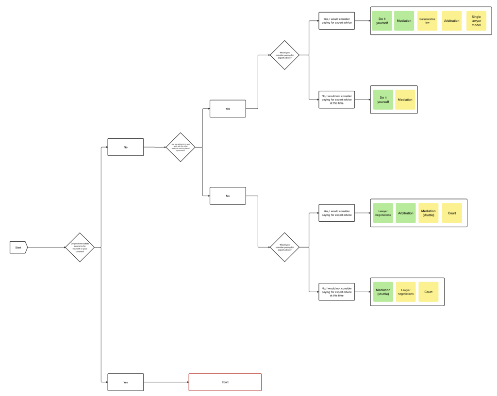
Decision tree mapping
Subject matter expert reviews
Decision tree mapping
Prototype design
User research (round 1)
Prototype refinement
User research (round 2)
Decision tree mapping
Mapping the decision tree was our first step in answering the question about whether it is even possible to develop the decision tree / logic path necessary to guide users to the ‘right’ resolution option(s) for their specific scenario and needs.
The mapping was also needed to enable the design of the prototype for user testing and to review with subject matter experts for accuracy, and with policy and legal colleagues to assess viability.
We realised we needed to go through a process of reduction, and from SME interviews, we found two variables that can be used to provide an initial list of suitable resolution options – the level of interaction between parents (i.e. their willingness to work together), and financial means.
We continued to refine the decision tree based on research with SMEs to define the scope for the prototype..
Subject matter expert reviews
We ran 11 SME (subject matter expert) interviews to inform the decision tree and prototype design.
some key insights
SMEs liked the concept, but worried about the nuance involved in guiding people to the right option and whether this can be replicated digitally.
People will use a combination of resolution options. There is rarely a single option for everything.
Emphasis on simple, digestible content that helps people reach an amicable agreement early.
Prototype development
We used some initial wireframes to help think about how the personalised content will be served to users. Stakeholder insights highlighted how the content messaging is just as important as the resolution options. We agreed:
Transparency: to ensure users understand why they are being shown the recommended options
Prioritisation: to ensure users still have access to other options
Using the decision tree logic, we created low fidelity wireframes in Mural, drafting questions, guidance (for question pages), and option/summary pages. Where possible, we re-purposed content from GOV.UK, NHS.GOV and other sources.
We iterated the content design based on feedback from stakeholder reviews and insights from the external stakeholder decision tree reviews.
choosing the right prototyping tool
We started building out a clickable prototype using a government form builder, however we were restricted in terms of content presentation. For example, there was no functionality to add guidance content on the questions pages, only hint text, and there was no functionality for a right-hand sidebar for the pros and cons on the options pages.
Since the form builder didn’t meet our requirements, we built the prototype in Figma. We also produced a flat screen prototype for a chatbot alternative to test with users. We used GOV.UK Design System patterns and components to create a prototype in line with GDS standards.


User research
research goal
Evaluate if a decision tree pathway can improve users’ experience of navigating their options during separation
study set-up
60 minute 1-1 usability tests
Remote sessions
2 rounds of testing across 2 weeks
Prototype, hypotheses and discussion guide changes were made between round 1 and round 2
tasks and scenarios
Show us how they search for information online about their options
Identify options relevant to them via prototype and existing site
Review the chatbot design
continuously iterating
We made changes to the prototype after the first round of testing to gain richer insights and better inform our hypotheses.
Changes included updating the content to soften the language in some areas, and provide more ‘next steps’ guidance. We also changed the presentation of the options provided on the summary page to highlight a single option intially, with accordion components to expand details about secondary options.
analysis
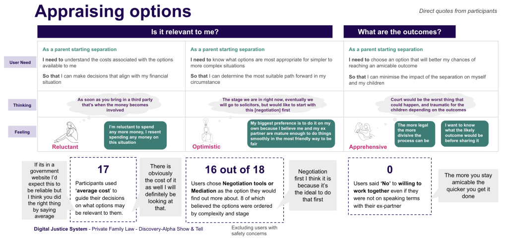
We conducted collaborative analysis sessions with stakeholders to ensure that the insights we gathered aligned with both user needs and business objectives. These sessions allowed us to combine different perspectives, enabling a more comprehensive understanding of the challenges and opportunities within the service.
We also facilitated empathy mapping workshops to delve deeper into the emotional and cognitive experiences of users. These workshops helped us capture the thoughts, feelings, and motivations of parents navigating separation to better understand their needs pain points at each stage of the journey.
By bringing stakeholders into these workshops, we ensured that the emotional aspect of user needs was front and center in the design process, fostering shared empathy and alignment on the direction of the service design.
We ceated user personas and enhanced them with mindsets to track evolving user needs across the journey. We also created a set of user journey maps to visualise their thinking when searching their options online.
Accessibility walk-through
We engaged with accessibility specialists to address accessibility needs of users, gain insights around the gaps in our understanding, and identify areas for improvement.
key take aways
Consider implementing helpline and other support features for the Assisted Digital route.
Majority of users may use mobile devices and so recommends swift transition from Figma to GOV.UK prototyping kit and ensure compatibility with assistive mobile technologies.
Proposed a “riskier” version of the prototype with only one-third of the text to accommodate users who may struggle with extensive reading.
Using everyday language to replace complex terms such as “Financial arrangements” with more understandable alternatives.
Recognising potential user impairments such as tiredness, stress or emotional upset and prioritising creating content that is easily digestible under these circumstances.
Consider collaborating with organisations with experience in chatbot accessibility.
Results
The user insights we captured shaped our recommendations to enhance existing website discoverability and modernise content. The insights we gathered revealed critical pain points in the current service experience, particularly around how parents searched for and processed information during separation. This led to targeted recommendations for streamlining the information architecture and SEO, ensuring that users could find relevant, trusted resources more easily.
Our research also highlighted gaps in emotional support throughout the journey, driving the development of new content and service touchpoints designed to address these unmet needs.
Our outputs shifted stakeholders’ focus from static to dynamic user needs. This shift prompted the team to rethink the service holistically. This not only initiated a new discovery phase but also encouraged a more agile, user-centered approach to future developments, ensuring that ongoing iterations of the service would be adaptable to the evolving nature of users’ separation journeys.
The insights informed prioritisation of future design work, laying the groundwork for further exploration of pain points across multiple user scenarios and personas.
Key learnings
Balancing Discovery with prototype delivery: One of the major challenges of this project was balancing the exploratory nature of a Discovery phase with the ministerial requirement to deliver a clickable prototype by the end of the project. We learned how to maintain the integrity of user-centered design while meeting strict deadlines, ensuring that the prototype not only fulfilled the requirement but also reflected real user needs.
Dynamic user needs: Through our research, we learned that users’ needs evolve significantly throughout the separation journey. By tracking these shifts, we created more responsive and adaptable solutions, highlighting the importance of designing for dynamic, rather than static, user requirements.
Iterative testing is essential: Conducting multiple user tests with prototypes allowed us to continuously refine our designs, ensuring that the service addressed real pain points. Early testing also validated our assumptions and provided crucial insights into how users engage with information.
Collaboration drives success: Close collaboration with SMEs and stakeholders was vital in aligning user needs with policy and leagal constraints. This helped ensure that the solutions we proposed were both practical and user-focused.